Grow
Grow Grow with HubSpot
 Migrate to HubSpot
 Advantages
 Our work


Share


Design
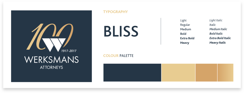
The Werksmans centenary corporate identity was designed by combining a rich, celebratory colour palette, with elements that subtly introduced the 100-year celebration. As the key visual, an image of an air balloon taking flight was used that represented the firm reaching new heights.
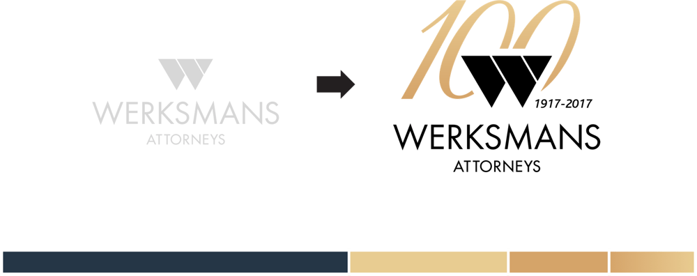
The gold and royal blue colours were used to build up the centenary look and feel and create a classic look that featured modern design elements. Lastly, the 100 was added behind the Werksmans icon and balanced in such a way that the two became a symbol that could be used as a standalone logo mark.