The Psychology of Colour
Colour plays a significant role in our lives as we interact with the world around us. It has an impact on our emotions, moods and can even influence our behaviour.
In this article, we will explore the interesting concept of the psychology of colour and provide a guideline on how different colours can affect our perceptions and emotions, and how this can be applied in branding.
It is important to note that our reactions to colours are not objectively fixed, but are also influenced by cultural context, individual backgrounds and tastes.
This article will therefore provide a general guideline of colour associations within a Western context.
What is the psychology of colour?
The psychology of colour refers to the study of how colour affects human behaviour and emotions, as well as the cultural and historical meanings of different colours.
Through the investigation of colour’s physiological and psychological influence on human beings, it helps us understand why certain colours are used in specific contexts.
This knowledge can be especially useful in the world of marketing as it can be used to effectively position brands in the minds of consumers.
Why is the psychology of colour important in branding?
A study by the University of Loyola in Maryland, USA found that colour boosts brand recognition by up to 80%. Colour is therefore one of the key components of a brand’s identity.
It is used to distinguish it from its competitors and reinforce the brand’s personality, promise and values to its target audience.
As colour influences us on an emotional level it is an effective persuasive tool. However, this is not the only method of implementing colour in design and branding.
The effective usage of colour in branding is also used to meet consumers’ expectations for certain products and services. Utilising a brown colour scheme for hygiene products, or pink for an environmental brand goes against our instinctive associations and expectations for these brands.
Therefore, successfully implementing colour into your brand combines art and science. The colour scheme of your brand should tap into our psychological and cultural programming to meet our ingrained colour associations, and it should also inspire the desired response from the target audience.
The following list provides a guideline on the most widely used colours and their most common associations.
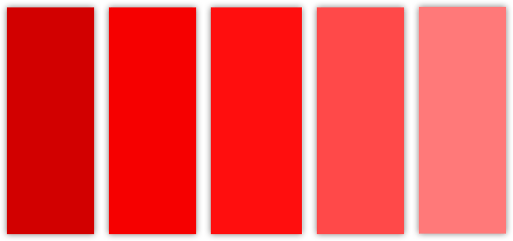
Red
Red is associated with excitement, energy, and action. It can signify importance and capture attention.
Red is also linked to strong emotions such as love, passion and desire. It motivates us to take action and is therefore often used for call-to-action buttons, sale icons or eye-catching packaging.
Red’s ability to grab people’s attention is also why it is used to indicate danger. Think of alarms, stop signs, rising temperatures, and red traffic lights.
Thus as red is one of the most intense colours in the human psyche it should be used if your brand wants to be bold and make a big impression, or it should be applied strategically to inspire the desired action.
Symbolises:
- Excitement
- Energy
- Action
- Warmth
- Love
- Passion
- Desire
- Danger
- Anger
- Aggression
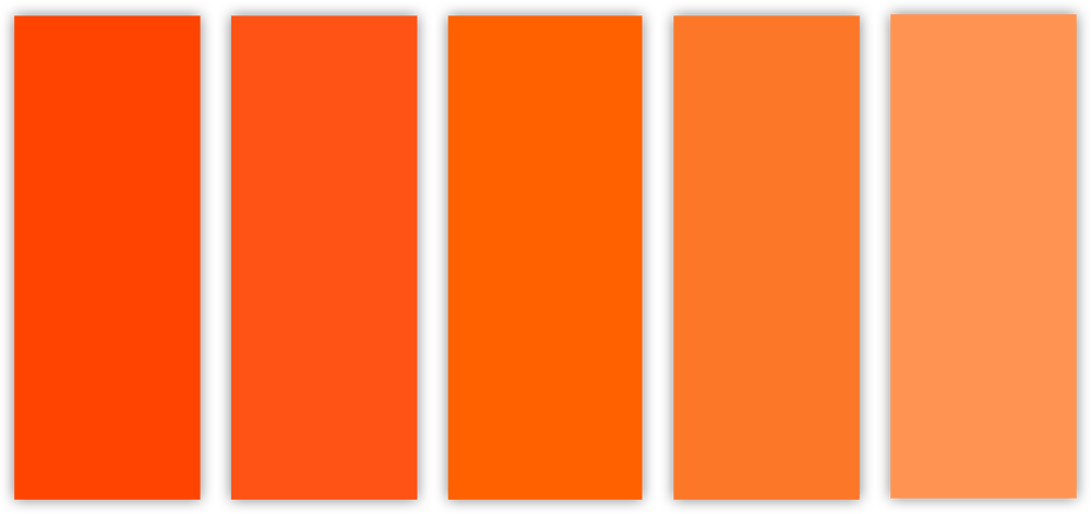
Orange
Orange represents enthusiasm, creativity, youth and adventure. It combines the energy and brightness of red (but without the association of danger) with the joy of yellow.
Orange adds fun and vibrancy to graphic designs which makes it a popular colour to draw people’s attention.
It’s also associated with youthful optimism and warmth which makes it a good option for marketing to young people, or if you want your brand to exude vitality, energy and playfulness.
However, more sophisticated brands might want to steer clear of orange, as it might be considered too frivolous, immature or boisterous by their target audience.
Symbolises:
- Enthusiasm
- Creativity
- Youth
- Adventure
- Vitality
- Playfulness
- Happiness
- Joy
- Optimism
- Warmth
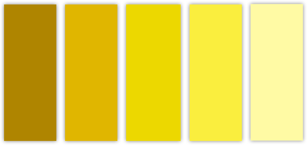
Yellow
Yellow radiates warmth, happiness and serenity. It evokes feelings of sunshine, summer, fun and positivity.
Yellow grabs attention and is quickly noticed by people, and is, therefore, an effective colour to use in branding.
Its ability to stand out is why it is often used to signify caution such as warning signs, security vests, police tape and school buses.
However, implementing yellow can also be a cheap tactic to attract eyes. Thus, consider using yellow as an accent or flourish colour, rather than the core component of a design.
Symbolises:
- Warmth
- Happiness
- Serenity
- Joy
- Optimism
- Positivity
- Cheerfulness
- Fun
- Warning
- Caution
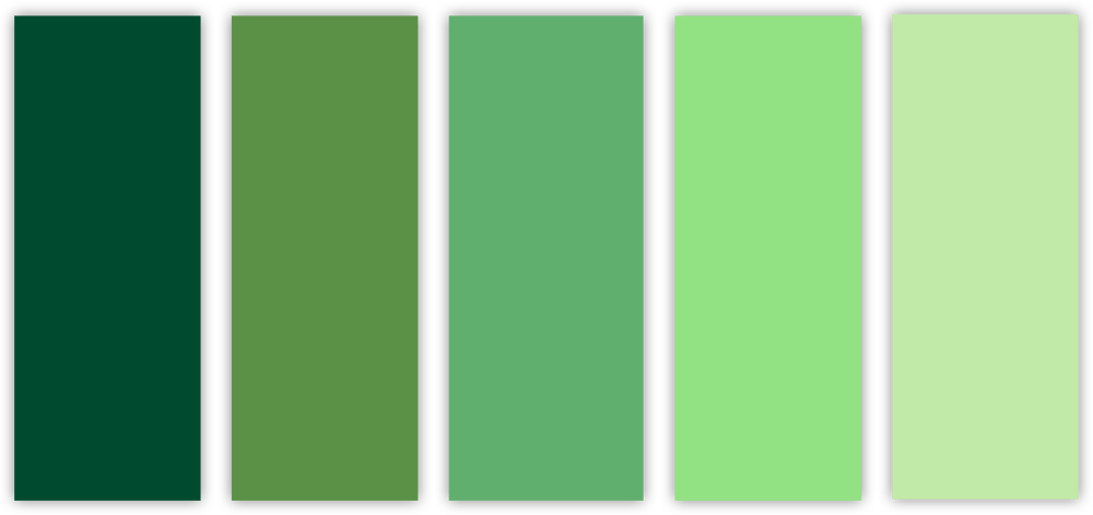
Green
Green has an ingrained connection to nature. It reminds people of lush jungles, plants, healthy produce, and sprawling meadows.
Green instinctively evokes associations with health, growth, renewal and safety. It is a relaxing and cool colour that revitalises the body and mind.
The usage of green in traffic lights has also conditioned human beings to link it to permissibility, forward movement and accessibility.
Green's connection to the environment makes it a great choice for health- and sustainability-conscious brands. Additionally, its association with prosperity and stability renders it a favourable option for financial brands.
Symbolises:
- Health
- Sustainability
- Freshness
- Calmness
- Relaxation
- Growth
- Wealth
- Prosperity
- Stability
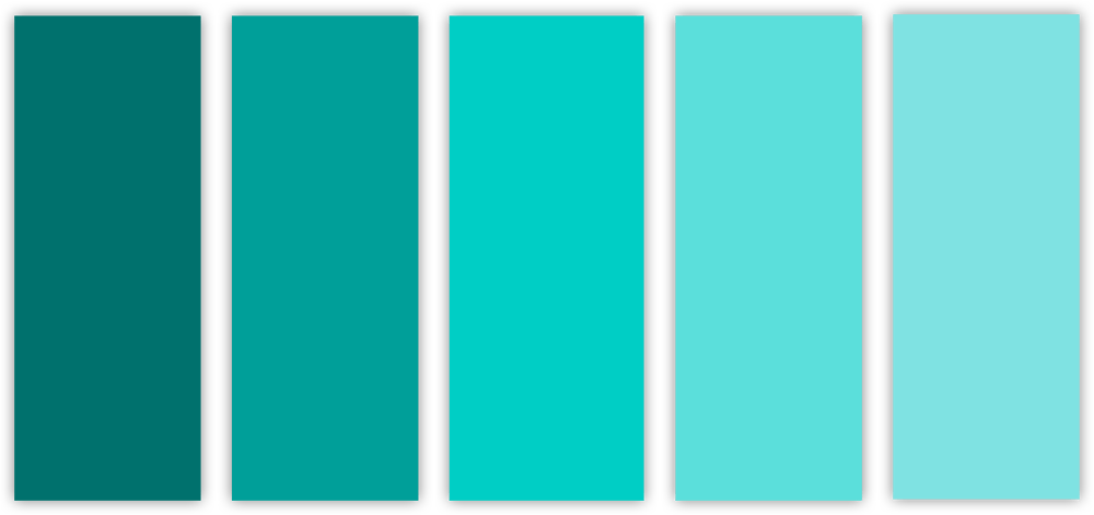
Turquoise
Turquoise is associated with calmness, tranquillity, and creativity. It has a balancing and harmonising effect on emotions by promoting inner calmness, balance, and clarity of thought.
Turquoise inspires feelings of freshness and cleanliness, while also stimulating creativity, self-expression, and communication. It has proven to be a popular colour in the interior design, fashion, jewellery, and tourism industries.
Symbolises:
- Tranquillity
- Calmness
- Serenity
- Balance
- Communication
- Creativity
- Refreshment
- Spirituality
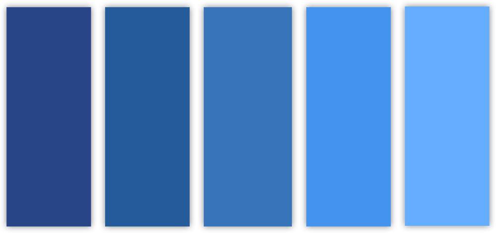
Blue
Blue represents trustworthiness, dependability, and confidence. It has a strong association with nature and reminds people of the sky, ocean or a body of water.
Blue is a cool colour that has a calming effect on the human psyche and evokes feelings of peace and security.
In branding, blue signifies professionalism, loyalty and honesty. It’s, therefore, a popular colour for a wide variety of brands (especially financial and tech brands) who wish to portray these values.
However, blue’s popularity means it is the most used colour in brand identities. Thus brands considering using blue should ensure that their visual identity is very distinctive.
Symbolises:
- Trustworthiness
- Dependability
- Professionalism
- Stability
- Loyalty
- Honesty
- Peace
- Calmness
- Tranquillity
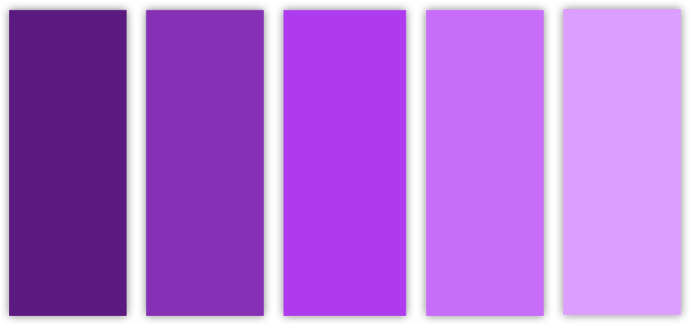
Purple
Purple symbolises royalty, luxury and mystery. Historically, purple was very expensive to produce as it required dye-makers to extract a purple-producing mucus from a specific species of sea snail and then expose it to sunlight for a precise amount of time.
So for centuries, purple garments were worn by emperors, kings and religious leaders.
In design, purple has been used to illustrate exclusivity and decadence, and has therefore been popular with beauty, fashion and chocolate brands.
Purple also stimulates imagination and creativity, and adds a flair of mysticism and mystery to designs.
Brands should caution against using too much purple, as overuse of the colour can cause feelings of frustration and an association of arrogance.
Symbolises:
- Royalty
- Luxury
- Nobility
- Spirituality
- Exclusivity
- Decadence
- Imagination
- Mysticism
- Mystery
- Arrogance
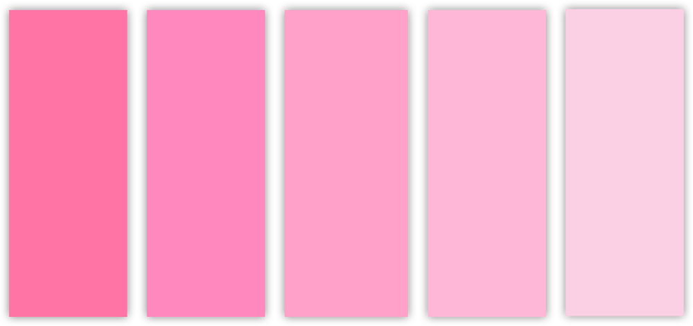
Pink
Pink demonstrates playfulness, fun, romanticism and sweetness. It’s a natural choice for brands that target youthful and casual audiences such as bakeries, sweets, and romantic resorts.
In a lighter shade, pink is considered delicate, nurturing and comforting, and is a good choice for children’s brands and baby products.
On the darker end of the spectrum a bright, neon pink feels funky and futuristic. It can therefore be applied to make bold statements or to represent brands that aim to be industry disruptors.
During the 20th century pink predominantly came to be associated with femininity and has become a reliant choice for female-oriented brands.
Symbolises:
- Playfulness
- Fun
- Youth
- Romanticism
- Sweetness
- Comfort
- Nurturing
- Femininity
- Funkiness
- Futurism
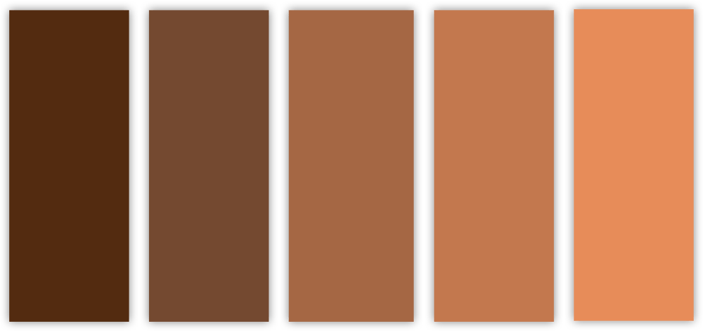
Brown
Brown is an earthy colour and evokes images of soil, wood and stone. It is associated with dependability, reliability and trust, and creates a sense of being unpretentious and down-to-earth.
Brown is therefore a good choice for agriculture, outdoors and rugged brands.
As the colour also evokes an old-fashioned, weathered and worn-in feeling, it’s also a great choice for vintage and handcrafted brands.
Brown is the least used colour in branding which makes it an option to easily distinguish your brand.
However, its association with soil and dirt means it is not a good choice for hygiene-associated brands in the medical, sanitation, and hospitality industries.
Symbolises:
- Dependability
- Reliability
- Trust
- Earthiness
- Outdoors
- Old-fashioned
- Unpretentiousness
- Authenticity

Black
Black is symbolic of power, elegance and sophistication. It is a heavy and strong colour that evokes feelings of authority, luxury and modernity.
In branding, black is popular among luxurious fashion, perfume, and lifestyle brands. Black also exudes mystery and edginess and is a good choice for technological and creative companies, as well as brands that wish to portray an unconventional identity.
Due to the versatility of black, it is often paired with other colours and works by either contrasting or complementing lighter shades in the design.
However, brands should be careful that their colour pairings remain minimalist in order to ensure that the design still encapsulates black’s primary associations.
Symbolises:
- Power
- Elegance
- Sophistication
- Strength
- Authority
- Luxury
- Modernity
- Mystery
- Edginess
- Darkness

Grey
Grey is the middle point between black and white and aptly represents neutrality and balance. It also signifies maturity, professionalism and dependability, and is a good choice for investment and legal brands who want to convey their trustworthiness.
However, grey does have some connotations of being dull, boring, and conservative.
Thus if your brand wants to communicate more energy and zest it would be best to steer clear of grey. Alternatively, grey pairs quite nicely with brighter colours which could give your brand the best of both worlds with the neutrality of grey blending with the key characteristics of the bright colour.
Symbolises:
- Neutrality
- Balance
- Maturity
- Professionalism
- Dependability
- Seriousness
- Formality
- Classic
- Dullness
- Conservative
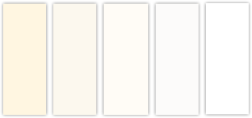
White
White symbolises cleanliness, purity and innocence. Interestingly, white light contains all colours on the spectrum, but human eyes perceive it as a complete lack of colour.
It’s therefore often associated with being a blank canvas full of potential and can be used as a base for more exciting colours.
In branding, white provides a minimalist aesthetic which is perceived as clean, simple and modern. White also offers the opportunity to utilise negative space which can help a brand’s visual identity to stand out, whilst also being perceived as clean and modern.
It is therefore popular with technological brands, luxury vehicle and fashion brands, as well as e-commerce websites.
Symbolises:
- Cleanliness
- Freshness
- Purity
- Innocence
- Simplicity
- Modernity
- Peace
- Ice
- Coldness
Final Thoughts
Selecting the right colours to represent your brand is more than just picking your favourite colour or choosing a nice-looking palette. Work closely with your designer and take some time to consider which colours would best communicate your brand personality and values, and differentiate it from your competitors. In doing so, you’ll be able to create a visual identity for your brand that is memorable and inspires confidence among your target audience.