Through my experience of working on business-to-business (B2B) website optimisations and redesigns, selecting the appropriate imagery can often become a headache for the design team and the client. Usually it's a trade-off between using stock photos (which are often perceived as too generic and clichéd) versus a bespoke brand-centric photoshoot, which can be expensive.
The good news is that visual storytelling on a website is not just limited to photographic images. On their own, these images do play a pivotal part of the website narrative, and it is important to get their tone and visual messaging right. However, they form part of a larger integrated system of visual communication elements that can be used at specific points to simplify complexity and guide prospects towards action.
Ultimately, B2B decision-makers subconsciously equate visual clarity with operational reliability. Visual storytelling therefore transcends decoration and is about weaving a cohesive thread through every design element to highlight your brand’s authenticity and expertise.
Thus, in this article, I will be unpacking how to replace text-heavy clutter with visual storytelling on your website to build trust and create a conversion-focused digital experience.
Why visual storytelling matters on B2B websites
Emotional and cognitive impact
Our brains are hardwired for visuals. According to a MIT study the vast majority of sensory information we process is visual and we interpret it within a fraction of a second. Compare that to reading through a dense set of copy relating to a company’s services and the likelihood is high that the reader would have clicked away long before the value proposition had become clear.
The strategic use of imagery on a website activates our pattern recognition instincts, thereby allowing busy stakeholders to quickly see how important pieces fit together.
Short attention spans
Senior decision-makers often skim a page before committing to a deeper read. Relevant and eye-catching hero banners, bold icon sets, and bite-sized data visualisation give them immediate context and a reason to stay.
When the essentials are visible at a glance, your visitors feel in control of their time and will likely delve deeper into your website. This is an underrated credibility cue as it signals that your brand will be just as efficient and transparent to work with.
Building trust
Trust in your brand erodes fast when your target audience sees stock photos that clearly have nothing to do with your industry. For example: Smiling models in headsets, or a group of people laughing at a spreadsheet, or the clichéd handshake shots. These images immediately feel inauthentic and raise doubts about how well you understand your own service or product offering.
In contrast, imagery that is related to your brand identity, people, services, or target audience demonstrates confidence. When every visual aligns with the narrative on the page, your prospects sense that the same attention to detail will carry through to your service delivery. Thereby reinforcing your authenticity and credibility.
Strengthening brand recognition
Visual storytelling works best when every design asset (logo placement, colour palette, icon style, etc.) feels like it's part of one integrated system. Repetition of these elements creates “memory hooks” that help busy B2B stakeholders recognise your company instantly.
See the example below of HubSpot, a cloud-based Customer Relationship Management (CRM) platform. They use a warm orange accent, simple icons and a friendly sans-serif font to convey its approachable and problem-solving identity. A prospect might first notice those elements on a LinkedIn post, then spot the same orange-toned illustrations on a webinar or a trade-show presentation.
When the prospect finally lands on the company’s website, the identical colour splash, icon set and typography greet them on the hero banners and product pages. This recognition confirms they’re in the right place, reinforces brand recall, and intuitively signals that the company is organised, consistent and trustworthy.
For any B2B company, mirroring this approach turns your website into the anchor that ties your entire digital presence together.

Streamlining user experience
A consistent visual language does more than just creating a polished look and feel on your website. It actively guides the target audience through complex information. Clear iconography, intuitive colour cues and well-spaced layouts help reduce the user’s cognitive load. So they can spend more energy evaluating your offer, rather than deciphering the interface.
By mapping the buyer journey through distinct visual patterns, such as colour coded product tiers or progress bars for multi-step forms, you create subconscious signposts that help decision-makers orient themselves in seconds.
5 key elements of effective visual storytelling on B2B websites
Visual storytelling isn’t just about adding images and icons to your website. It’s a strategically crafted system that aligns every design choice with your website’s key narrative. Here follows the 5 foundational visual elements that transform B2B websites from static digital brochures into dynamic, audience-centric experiences.
1. High-quality imagery
Key pages: Home and Services
The hero banners are the first thing that visitors will see when they land on your website. These introductory sections are especially important on your key pages such as the home and services pages. Thus, an image should be implemented that conveys your value proposition and brand personality in conjunction with the page headline and subheading.
It is ideal to commission photography that showcases your business, people and services. However, depending on your brand identity or business type, as well as budget and time constraints, bespoke photography will not always be relevant or possible.
Stock photos
In these instances, stock images are the way to go, but be cautious of using clichéd or irrelevant stock imagery. Here are a few tips on using stock images so that it elevates your website’s visual storytelling:
- Look for authenticity cues: Don’t use images with exaggerated smiles, handshakes, or unrealistic offices. Look for natural posture, believable equipment and genuine work settings.;
- Colour-grade and crop for cohesion: Apply the same brand-colour overlay or filter and crop the images for consistent aspect ratios. This helps disparate stock-images look consistent and integrated across your website.;
- Prioritise close-ups of process and detail: Tight shots of, for example, machinery, dashboard screens, or product components feels specific and reduces the need to include unfamiliar faces on your website.;
- Accurate representation of target audience: Select photos that reflect the geographic location, gender, race, age, etc. of your customer base. This authentic representation builds credibility and trustworthiness.

About page
Authenticity is paramount on the About page. Visitors expect to “meet” the company on this page, so using stock photos here will be detrimental to your brand image. Instead, include photos of your leadership team, the offices, and team-building activities. Showcasing the genuine faces and spaces of your company personalises your brand and helps the target audience to establish a connection with your business.
Golden rule
In summary, when selecting images for your website, always use images that are authentic, on-brand and purposeful. If an image doesn’t complement the story you are telling, remove it and select one that does.
2. Consistent typography and colour hierarchy
Whilst the imagery sets the scene and works in conjunction with the website messaging, the typography and colour do the work of steering the user’s eye and reinforcing the brand personality. A clearly defined type scale for headings, body copy, and linespacing creates a predictable rhythm that makes dense information feel organised, rather than overwhelming.
Additionally, incorporate a disciplined colour hierarchy, such as the primary brand colour for CTA’s, secondary colours for section breaks or subtle accents, and neutral colours for body copy.
This consistency signals that your internal processes are also methodical. If headlines and subheadings are inconsistent, or if CTAs compete in several colours, the user’s cognitive load spikes and their confidence drops.
Creating and implementing a practical style guide
Work with your design team or agency to start codifying a mini-style guide for your website. For example:
- Define a type scale: Choose one primary font family (plus a contrasting accent - only if necessary) and map out fixed sizes, weights, and line-heights, for headings (H1 - H6), subheadings, body copy, and buttons.
- Assign colour tokens: Translate your brand palette into colour tokens such as primary (CTAs and links), secondary (section accents), neutral-dark (body copy), and neutral-light (backgrounds).;
- Audit and corrections: Review the existing webpages for any inconsistencies with the style guide and make corrections as necessary.
- Create reusable components: Build modules of repeating structures (such as hero banners, features, benefits, and CTA banners) in your CMS so that new pages inherit the hierarchy by default, which should minimise stylistic errors moving forward.

3. Iconography and brand elements
Icons and brand-centric symbols or patterns do the quiet repetitive work of reinforcing your brand identity whilst supporting the messaging on the webpage. They act as a visual shorthand that knits the site together, which helps a busy B2B target audience skim-read without losing context.
Icons
Icons are the micro-messengers of a B2B website. They are small enough to stay out of the way, but impactful enough to convey meaning at a glance. For example, a fintech platform can implement a stylised padlock for ‘Secure Payments’, two-curved arrows around a central coin for ‘Multi-currency accounts’, and a globe for ‘Cross-border transfers’.
It is true that in some instances icons can be cheesy and dated. For some brands they work well, whereas for others they don’t. However, their core application principle remains the same: Breaking up dense information into digestible chunks.;
Thus, if your website and brand aligns well with icons, they can be valuable signposts that enrich the narrative. If, for some reason, they don’t work on your website, look for alternative methods to break up your messaging into quick skim-reading sections.
Brand-centric symbols
Compared to icons, brand-centric symbols and patterns play a broader role on your website by stitching together individual pages into a cohesive digital fabric. When used sparingly, these motifs become the visual “through-line” of your brand story.
They should be subtle enough to never distract from the messaging, but distinctive enough to be recognisable. By repeating a few of these symbols and patterns they turn your website from a generic template into a space that feels unmistakably yours.
4. Infographics, illustrations, and data visualisations
Complexity is part and parcel of B2B offerings. Whether you’re trying to explain multi-layered pricing models, or the flow of data through a cloud stack - infographics and data-led illustrations translate that complexity into visuals that the brain can decode in seconds.
Infographics
Infographics condense sprawling data sets or multi-step processes into a single, shareable canvas. For example: A carefully layered hierarchy such as headline statistic, supporting chart, and a one-line caption, lets busy executives find the “so what” in seconds.
Illustrations
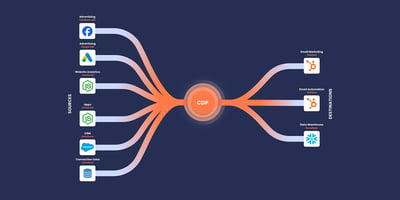
Illustrations step in when photographs can’t reveal the invisible, such as data flows or abstract architectures. For example: A workflow automation software visually demonstrates how winning a sales deal seamlessly triggers a task creation within a project management tool. This simplified diagram translates complex integrations and processes into an intuitive visual a non-technical CFO can understand.
Data visualisation
Data visualisation turns live or near-real-time numbers into proof. By translating raw metrics into intuitive charts, gauges or counters, it helps decision-makers spot trends and ROI in seconds, instead of wading through spreadsheets.
For example: An industrial logistics company can employ an interactive production line graphic. Visitors can drag sliders for “machine hours” and “energy cost” and the line chart beside it recalculates projected savings in real time. This dynamic visual turns abstract percentages into personalised, cost-based evidence that resonates with operations and financial stakeholders.
5. Videos and animated explainers
Videos and animated explainers are another powerful method for simplifying complex information. A sixty-second product tour or animated workflow can compress pages of technical copy into a story that potential buyers can quickly understand.;
Busy executives often do research between meetings. Thus, a short video that quickly outlines the problem, shows the solution and proves the outcome, will convey the key value proposition before their attention moves elsewhere.;
However, be cautious of employing too many videos on your website. This will fragment the narrative and become a barrier that dissuades the target audience from engaging with your content. But when it is used strategically and with narrative intent, video and animation can turn static pages into immersive proof points. 
Final thought
In the B2B landscape where key stakeholders’ attention and time is scarce, visual storytelling isn’t optional, but rather a critical requirement on business websites. By strategically weaving authenticity, consistency, and clarity into the key visual elements, B2B brands can differentiate themselves from competitors and guide prospects to confidently engage with their websites.


