In the digital age where a consistent, integrated brand identity and intuitive user experience are paramount, the subtle art of typography emerges as a key component in crafting a brand’s narrative. While often perceived as the mere selection of fonts, typography fulfills a variety of important functions within the context of digital branding.
The process of developing a brand’s typography is therefore important, as it not only affects the visual appeal, but also the target audience’s interaction with the brand. This article provides a four-part overview of how typography transcends aesthetic boundaries and plays an important strategic and functional role in the digital landscape.
Furthermore, typography’s psychological influence and ability to convey meaning and elicit emotional responses are also briefly explored. This overview concludes with a quick guide on how to select the appropriate font for your brand.
 Contents
1. Typography in digital branding: Shaping brand identity and user experience
In the world of digital branding typography extends beyond just font selection. If implemented effectively, typography moves beyond aesthetics and becomes a multifaceted strategic tool that plays an important role in communicating a brand’s visual identity and key messages. In order for a brand to stand out in a crowded digital environment and connect with its target audience, typography can be applied strategically in the following three areas.
Brand Identity
Typography is integral to a brand’s visual identity, as each font type embodies specific characteristics and emotions that contribute to the overall brand perception. The consistent use of specific fonts across various digital platforms, such as websites and social media, aids in building brand recognition and differentiation from competitors.
User Experience
In digital media, a brand’s typography must adapt to different devices and screen sizes to ensure legibility and a positive user experience. Furthermore, when effectively implemented, typography enhances user engagement by creating a visual hierarchy that guides users to important information and intuitive navigation paths.
Accessibility is also one of the key considerations when developing a brand’s typography. Compliance with the Web Content Accessibility Guidelines (WCAG) is paramount, as it considers the needs of all users, including those with visual impairments.
Consistency
As the digital landscape is constantly evolving, maintaining typographical consistency is very challenging, but is crucial for ensuring brand consistency across multiple digital channels. Inconsistent typography can damage a brand’s image, whereas a unified approach reinforces the brand identity and effectively communicates key messages.
Typography is therefore not just a design choice, but an important element of a brand’s digital strategy. And when typography is executed well it plays a key role in distinguishing a brand in the dynamic and competitive digital landscape.
2. The psychological influence of typography
In addition to typography’s aesthetic and strategic value, it also plays an important role in conveying a brand’s personality and evoking emotional responses from the target audience. Typography can express tone, character, and style of a brand, and thereby influence how viewers perceive and interact with the brand’s key messages.
But how exactly does typography exert this psychological influence? The following 5 typographical components briefly explain how it can set different tones and evoke different reactions.
Font Associations
Different font types, such as Serif, Sans-serif, and Script, exude distinct characteristics. For example, Serif fonts are linked to tradition and reliability, Sans-serifs project a modern and clean image, and Script fonts convey elegance and creativity. A brand’s font selection should therefore ensure that it aligns with the brand’s personality and values.
Font Weight and Style
The weight and style of a font, ranging from light to bold, and from regular to italics, affect how text is perceived. Lighter fonts are seen as delicate, whereas bold fonts signify strength. The style of a font can create visual interest, add a personal touch, or emphasize certain aspects of a brand’s message.
Line and Letter Spacing
The spacing between letters (tracking) and lines (leading) influences readability and tone. Tight spacing can convey urgency or efficiency, but can be overwhelming for a reader. In comparison, more generous spacing imparts a sense of luxury and presents the text in a more easily digestible manner.
Context and Cultural Associations
Fonts can evoke specific emotions or connections with particular audience segments based on historical, cultural, or geographical associations. This aspect is important for brands operating in global markets or across multiple cultures.
Colour Integration
Integrating a brand’s typography with its colour palette is important for reinforcing a brand's personality and emotional appeal. This combination should complement the brand's desired attributes.
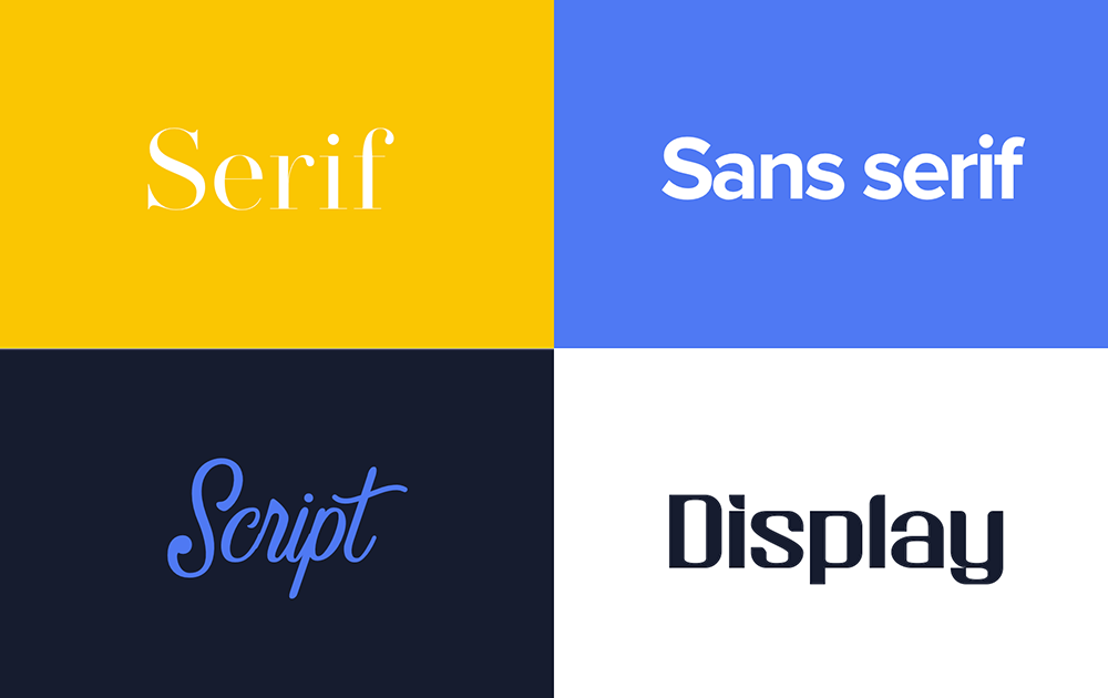
3. Digital brand building: A helpful guide to the 4 major font types
As part of the process of establishing a unique and recognisable brand identity, it is important to understand the differences between the major font types. Each font type contains inherent associations that, as a component of a brand’s visual identity, can convey certain characteristics and values.
Fortunately, it is not necessary to obtain in-depth knowledge of a large number of fonts, but rather just a basic understanding of the primary characteristics and associations of the four overarching font types: Serif, Sans-serif, Script, and Display. The following breakdown highlights the primary associations of these font types which will help guide the appropriate font selection for brands.
Serif fonts
Serif fonts are characterised by small decorative lines at the ends of the letters and symbolise tradition, sophistication, and professionalism. These fonts are deeply rooted in history and are popular in the law, finance, and business consulting industries.
Sans-serif fonts
Sans-serif fonts do not have decorative lines and represent modernity, clarity, and innovation. These fonts became prominent with modernist design movements and consequently have been ideal choices for brands in the technology and creative industries, as well as brands aiming to portray a contemporary image.
Script fonts
Script fonts resemble handwriting and convey individuality, authenticity, and artistic flair. These fonts portray a personal touch to a brand’s identity or messages, and have proven to be a popular choice for beauty, fashion, and luxury brands.
Display fonts
Display fonts are designed for high-impact and attention-grabbing purposes and tend to break away from traditional norms with unusual shapes. These fonts are popular amongst brands in the entertainment, and food and beverage industries, who want to highlight their expressive and distinctive qualities.
In summary, each font type significantly shapes a brand's identity and influences audience perception. Strategic selection and integration of these fonts into a brand's identity can effectively communicate its values and personality, thereby enhancing the potential for a resonant relationship with the target audience.
4. A 4-step guide to selecting the ideal font for your brand
After learning about the strategic, functional, psychological, and aesthetic values of typography, the font selection process can feel quite intimidating and overwhelming. Although this process is an important one, it does not have to be a black hole of endless options and requirements.
To simplify the process of selecting the right font for your brand, the key insights from the strategic role of typography in digital branding, the psychological influence of typography, and the 4 major font types, have been summarised into the following couple of steps.
Step 1: Understand Your Brand Identity
The chosen font should reflect the brand’s core values, personality, and tone. This involves identifying and understanding the brand’s values, messaging strategy, and visual elements such as colour palette and imagery.
Step 2: Align With Your Target Audience’s Expectations
It is important to understand the demographics, preferences, and expectations of the target audience. The font should not only represent the brand, but also resonate with the target audience and fit your brand’s sector.
Step 3: Apply Industry Insights
Different industries often favor specific font types, which have become ingrained in the audience's minds over time. Thus, selecting a recognisable font type can improve the chances of your brand quickly connecting with the target audience.
Step 4: Practical Font Testing
Before making a final decision on the font for your brand, it is important to test its legibility, scalability, rendering consistency across browsers and operating systems, load times, aesthetic consistency, and integration with the brand colours. This will ensure that the font is working effectively and maintains consistency across various digital media.
Final Thought
Typography is a tapestry woven with strategy, functionality, aesthetics, and psychology. When it is effectively implemented in the realm of digital media, it can elevate a brand’s visual identity, improve target audience engagement, and differentiate it in a crowded landscape. Ultimately, the right typography can transform a simple message into an impactful brand story.