Selecting the right font for your brand can feel overwhelming. There are many factors to consider and a seemingly endless list of fonts. To simplify this process, all of the important information about the strategic art of typography in digital branding, the psychological influence of typography, and the 4 major font types, have been synthesised into the following 4-step guide for selecting the ideal font for your brand.
This article looks into the key considerations for selecting a font that not only embodies your brand's identity but also aligns with your target audience's expectations and industry norms. It also highlights practical insights and techniques for testing font applications, to ensure that your choice not only looks good, but performs excellently across various platforms and conditions
Key Takeaways
- The selected font should reflect your brand’s core values, personality, voice, and tone.
- Your brand’s font should be appropriate within its industry and be aligned with your target audience’s preferences and expectations.
- Before making a final decision on your brand’s font, test its legibility, scalability, browser and operating system rendering consistency, load times, aesthetic consistency, and application on brand colours.
Step 1: Understand your brand identity
The fonts that you choose will form an important part of your brand’s visual identity alongside your logo and colour palette. It is therefore important to understand the core aspects of your brand identity to determine which characteristics the fonts need to represent.
A quick way to identify the important aspects of your brand identity is to ask the following questions:
- What are your brand’s core values?
- What is your brand’s personality and which character traits do you want to portray to your target audience?
- What is your brand’s voice and tone, and how does it tie in with your key messaging?
- What colours are included in your brand’s colour palette, and what psychological associations do these colours present in your brand?
- Are there any other important elements in your brand identity (such as imagery, iconography, patterns, or textures) that communicate specific values or characteristics?
Once you have a clear understanding of your brand’s essence, and what values and characteristics it conveys to your target audience, you will be able to identify which font type associates best with your brand.
Step 2: Align with your target audience’s expectations
Different fonts appeal to different demographics. So it is important to have a clear definition of your target audience and what their expectations are concerning your brand.
Firstly, develop a clear understanding of your target audience’s demographics, such as their age, gender, profession, location, and culture. Furthermore, from a psychographic perspective, determine their needs, pain points, product or service interactions, and media consumption habits.
When you have detailed your target audience, you can more accurately determine which font type will not only best represent your brand, but also resonate with the target audience.
For example, if you are a law firm, a Script font will likely be interpreted as too informal, inappropriate, or eccentric for your brand. A Serif font that conveys trust, authority, and professionalism will be much more aligned with what the target audience expects from such a brand.
Conversely, a recruitment agency targeting young professionals in the technology industry will be well suited with a Sans-serif font that conveys the brand’s modern and contemporary characteristics. Additionally, this font can be paired in the brand’s typography with a Script font to accent keywords in the brand's messaging. Thereby also illustrating the brand’s authenticity and creativity, which would be attractive features for young, innovative professionals.

Step 3: Apply industry insights
Different industries often favour different font types. The link between the respective font types and their associated industries have developed over a very long period and is generally ingrained into the minds of the target audience.
It is therefore advisable to select a recognisable font type within your brand’s industry. There will still be more than enough creative room to develop a font that conforms to industry norms, but is unique to your brand. In doing so, you will give your brand a good opportunity to intuitively resonate with the target audience.
For example, a financial services brand implements a Serif font to convey tradition, timelessness, and trustworthiness. Or a disruptive technology and media company implements a Sans-serif font to illustrate their innovative and cutting-edge services.
Lastly, an important factor to be aware of is trends. Whilst it is necessary to keep an eye on trends within your brand’s industry, it is of higher importance to select a font that will establish a lasting relevance for your brand. Trends often date quickly and do not align well with brands aiming to establish a durable image.
Step 4: Test the font on various platforms
Once you have done your research, and selected a font that represents the brand’s core characteristics and resonates with your target audience, you need to test the fonts in your typography across multiple digital platforms and applications.
The following 5 tests provide a robust assessment criteria to determine the accessibility and suitability of your font in the digital landscape.
1. Legibility, Responsiveness, and Scalability
A font’s legibility can be tested by incorporating it into sample layouts and reviewing it in different sizes and on different devices such as desktop screens, tablets, and smartphones.
Key aspects to focus on include whether the font maintains its legibility and aesthetic appeal when scaled up for large displays or down for smaller screens, and how it behaves under different orientation modes (portrait vs. landscape).
Tools like browser developer modes and responsive design testing software can simulate a range of devices and screen sizes, allowing you to scrutinise the font’s adaptability.
Legibility testing should also consider diverse user environments, such as varying screen resolutions, different lighting conditions, as well as potential accessibility challenges for users with visual impairments.
It is important to pay attention to factors such as character spacing (tracking), line spacing (leading), and word spacing. Gathering feedback from a range of users, including the target audience, can provide valuable insights into the font’s overall legibility and effectiveness in conveying the intended message.
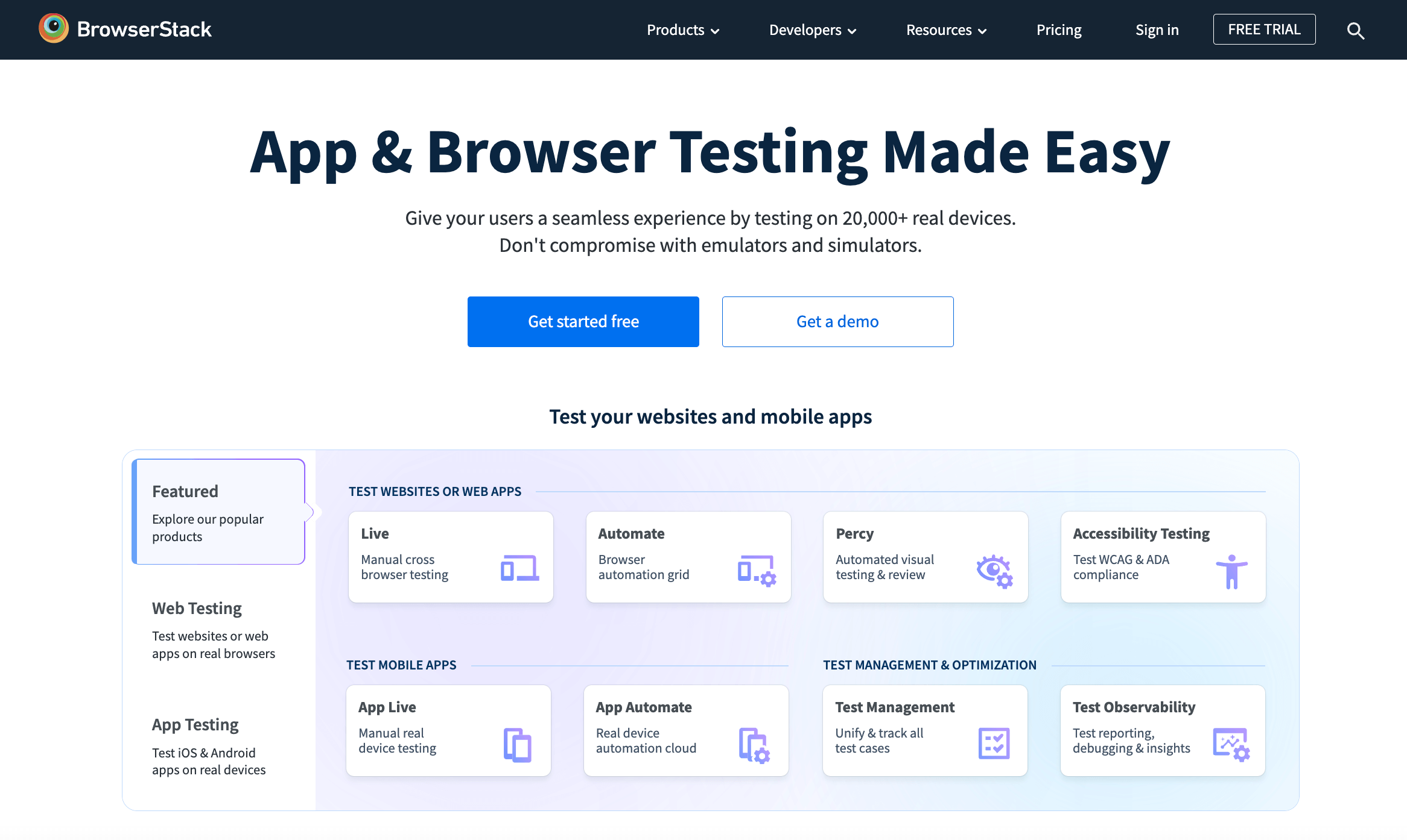
2. Rendering Across Browsers and Operating Systems
Testing a font's rendering across different browsers and operating systems is crucial for ensuring a consistent user experience. This involves systematically checking how the font displays in major web browsers (Chrome, Firefox, Safari, etc.) and on various operating systems (Windows, macOS, iOS, and Android).
Tools like BrowserStack or cross-browser testing features in web development environments can be used to simulate the appearance of the font across these platforms.
It's important to pay attention to any variations in font-weight, spacing, or alignment, as these can significantly affect the legibility and overall visual impact.
3. Load-times and Performance
This test involves evaluating how the font affects the overall speed and efficiency of a website or digital application. Heavier font files can slow down website performance, especially on mobile devices. Thus, the aim should be to use web-optimized fonts to balance aesthetics with performance.
Load-times and performance can be tested on tools like Google PageSpeed Insights, GTmetrix, or WebPageTest, which analyze the loading speed of a page and identify elements that may be slowing it down, including fonts.
Testing in real-world conditions, across different network speeds and devices, provides a comprehensive understanding of the font’s impact on performance.
4. Aesthetic Consistency
This assessment includes integrating the font into different types of content in various channels (e.g. website, social media collateral, email newsletters, etc.) and then systematically reviewing it for visual harmony and brand alignment.
Check that the fonts work well in headings, body text, CTAs, and other applicable UI elements. Additionally, gather feedback from diverse stakeholders which will provide insights into how the font is perceived. Doing so will not only ensure consistency, but also resonance with the target audience.
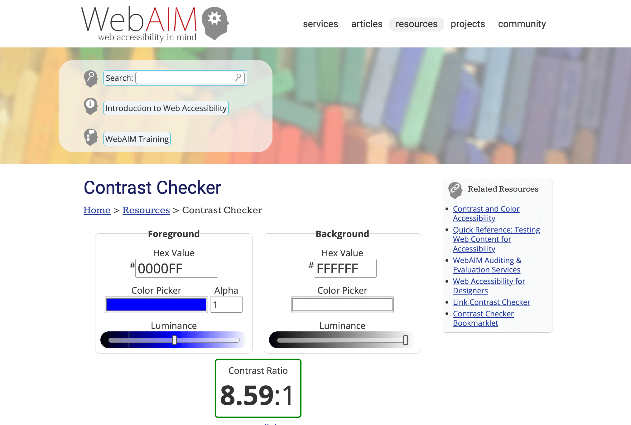
5. Colour and Contrast
Testing the color and contrast of a font involves evaluating its visibility and readability against various background colors and under different lighting conditions.
This can be done using digital tools like the WebAIM Contrast Checker, which assesses text and background color combinations to ensure they meet accessibility standards, such as the Web Content Accessibility Guidelines (WCAG) for contrast ratios. This ensures that the font remains legible for all users, including those with visual impairments.
It is important to also consider the brand’s colour palette and the intended emotional impact of certain colour combinations, to maintain consistency and effectiveness of the font’s application.
Final Thought
Selecting the right font for your brand is an important process that blends aesthetic appeal with strategic and practical relevance. The right font can become a powerful tool for your brand which can differentiate it from competitors, and create a consistent and memorable visual identity. Furthermore, by thoroughly testing your chosen font, you can ensure that it not only looks good, but also functions effectively and efficiently across all digital touchpoints of the brand.