The strategic design of a B2B website’s structure, content and user experience (UX) is essential for creating a positive and engaging experience for a business’ target audience. It directly impacts user satisfaction, conversions, brand perception, and search engine rankings, making it a critical aspect of a successful website and overall digital stratcruciaegy.
Conversely, a bad user experience not only damages a business’ brand, but results in a poor conversion ratio, lost opportunities and revenue, and decreased customer loyalty.
A well-designed and user-centric website is therefore a crucial component of a company’s overall business strategy.
A B2B website generally consists of the following key components and pages:
- Navigation: A roadmap that guides users to find information easily, enhances the user experience, and encourages engagement.
- Home: Serves as the virtual front door of a website, making the first impression on users and providing a central hub for navigation and information.
- About: Provides essential information about the company and its team which establishes credibility and trust.
- Service / Product: Showcases the offerings and expertise of the company, helping users understand the value they can receive from the business.
- Blog: Enables the company to provide valuable content, establish authority, engage with the audience, and drive organic traffic to the website.
- Contact: Facilitates direct communication between the company and its audience, enabling inquiries, support, and opportunities for engagement.
This article will provide a breakdown of these key components and a general best-practice guideline on the structure and content strategy to implement for an optimal user experience.
What is a B2B website?
B2B websites are designed to cater to businesses and professionals. They focus on providing information, products, or services that meet the needs of other businesses.
B2C websites, on the other hand, target individual consumers and aim to provide products or services that fulfil their personal needs and preferences.
An airline is a good example of a B2C business. A management consultancy is a good example of a B2B business.
How is a B2B website different from a B2C website?
Target audience
As mentioned above - the target audience is different - B2B websites are designed to cater to businesses and professionals. B2C websites, on the other hand, target individual consumers.
Sales cycle
B2B transactions typically involve longer and more complex sales cycles. They may require negotiations, proposals, and contracts. B2B websites often provide detailed product or service information, case studies, whitepapers, and other resources to assist businesses in making informed decisions. B2C transactions usually have shorter sales cycles, with consumers making quicker purchasing decisions.
Product / Service complexity
B2B products or services are often more complex and specialised than B2C offerings. B2B websites may include technical specifications, industry-specific details, and customisation options to address the specific requirements of businesses. B2C websites generally focus on presenting products or services in a more straightforward and easy-to-understand manner.
Content and Messaging
B2B websites often emphasise informative content, such as industry insights, thought leadership articles, and educational resources, to establish credibility and build trust with businesses. B2C websites typically focus on persuasive messaging, highlighting product benefits, discounts, promotions, and testimonials to appeal to consumers' emotions and encourage immediate purchases.
What is the structure of a B2B website?
A B2B website generally contains a main navigation system and the following core pages:
- Home
- About
- Service / Product
- Blog
- Contact
These pages play an integrated role in informing the target audience with the ultimate goal of generating leads. By strategically crafting the user-experience (UX) and user-interface (UI), a business has the opportunity to guide its target audience along this journey by telling a compelling story that differentiates it from its competitors.
The website structure and user journey should therefore be intuitive so that the users can easily find the information that they are looking for, whilst simultaneously enhancing the brand image and achieving its business goals.
Below is a guideline of website structure best practices that can be implemented across the core pages to effectively deliver a business’ key message and achieve its primary goals.
Navigation
A B2B website’s navigation consists of a main menu located at the top of the webpage and a footer located at the bottom.
Main menu
- The main menu should help the target audience quickly understand the website structure and easily navigate to the information that they are looking for.
- The menu items should be clear, appropriately named and intuitively organised.
- HubSpot recommends no more than 7 main menu items and 3 levels deep.
Footer
- The footer is a secondary navigation option that provides quick access to:
- essential webpages (About, Services, Pricing etc.)
- legal details (Terms and Conditions, Privacy Policy, Copyright)
- contact information
- social media pages
- additional resources (News, FAQs)
- The footer should also be utilised to reinforce branding elements such as incorporating the company logo, colour scheme and other visual elements.
- Overall, it should ensure a positive user experience from both a navigation and brand perspective.
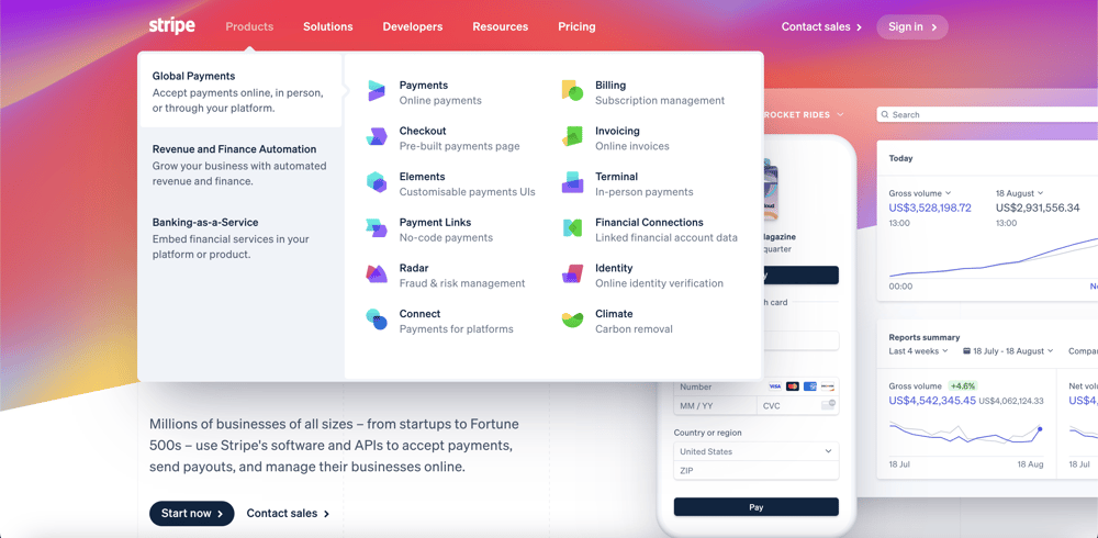
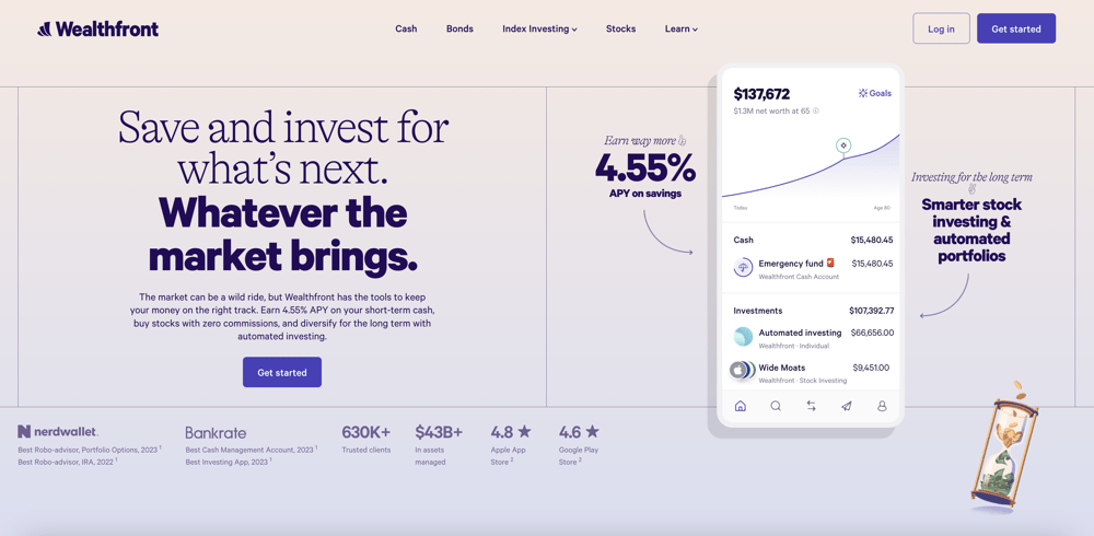
Home page
Generally, the home page gets the bulk of a website’s traffic and is often the first page of a website that a user visits. On average users decide within 10 - 20 seconds whether they will continue spending more time on the website or leave. It is therefore crucial that the home page immediately makes a great first impression.
Headline
- The headline should be clear, simple and communicate what the company has to offer (i.e. its value proposition).
- It should answer what you do.
Sub-headline
- The sub-headline should briefly elaborate on the main headline and reinforce the value proposition.
- It should answer how you’ll do it and what’s in it for the target audience.
Hero image/video
- It should be a brand-centric visualisation of your key message that creates visual interest and supports the headline and sub-headline.
Call to action (CTA)
- The CTA should guide the user in terms of taking the desired action in the conversion journey.
- It should be explicit in indicating what will happen when the target audience clicks on the link. (E.g. Contact Us, Book a demo, Download ebook, etc.)
- The design should also be clear and distinctive so that the user instinctively knows that it is a link.
Trust factors
- Trust factors should serve as proof of your credentials and further support your primary value proposition.
- People are generally looking for the fastest way to make a decision and trust factors go a long way in concisely presenting strong evidence to back up your value proposition.
- Examples include:
- Attention grabbing statistics
- Achievements and/or awards
- Testimonials / Customer success stories
- Case studies
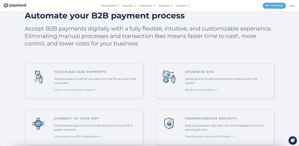
Services / Products overview
- This section should provide a summarised view of your key services or products.
- The services/products should be presented in an easily digestible and visually appealing manner.
- The user should be able to immediately distinguish between the different services/products and navigate to the respective service/product page if they want to.
- The user experience should be intuitive and seamless, and speedily guide the user to the information they are looking for.
Company overview
- This section should provide a brief introductory overview of your business.
- It should answer why you do what you do.
- As business and leadership visionary, Simon Sinek, famously stated: “Start with why. People don’t buy what you do, they buy why you do it.” So providing insight into your “why” should be a key theme across your website.
Images
- Images help to break down a continuous flow of copy on your website into easily digestible chunks and they also help to tell your brand story.
- The usage of images should trigger the psychological concept of ‘mirroring’ in the target audience. In other words, the imagery should put the user in the required mood to effectively convey your intended message. For example: adventure, excitement, trust, happiness, creativity, etc.
- Mirroring is a way to build empathy and rapport with the target audience and can therefore be utilised to ensure the desired impact of your brand messaging.
Services / Products benefits
- This section should provide a list of service or product-related benefits that separates your company from its competitors.
- It should align with your overarching brand story and explain why your service or product is important to your target audience.
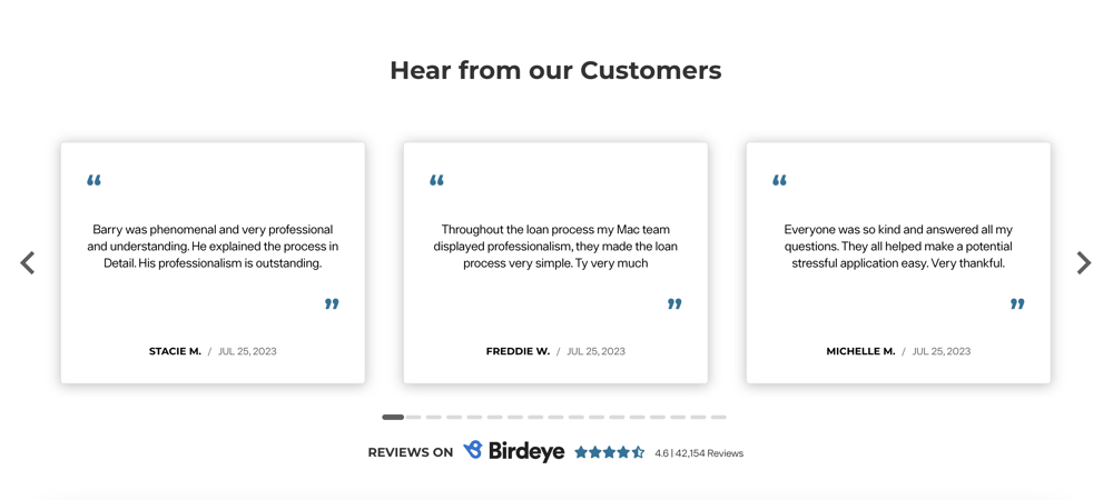
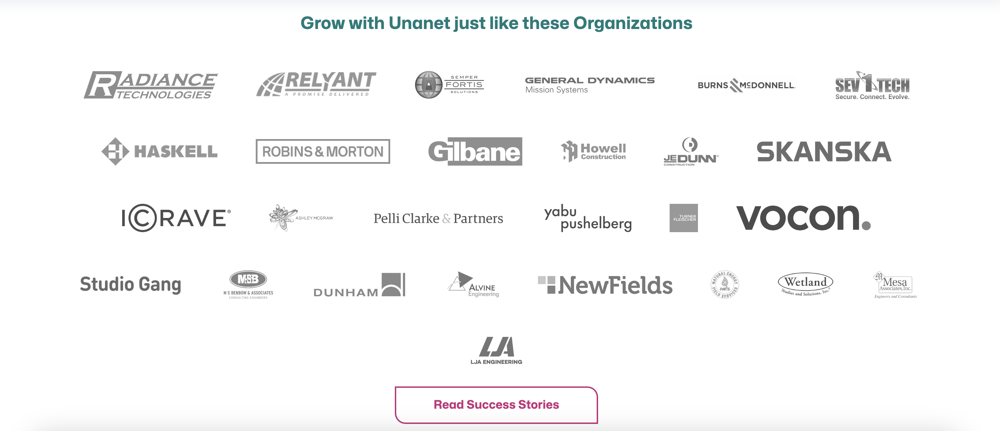
Social proof
- Including social proof in the form of listing the companies that you’ve worked with, client testimonials, or case studies serves as a confirmation to your target audience that you are trustworthy.
- Social proof provides further evidence in support of your value proposition and helps your target audience make their purchase decision.
Secondary CTA
- A clearly distinguishable CTA should be listed near the end of the webpage to guide the user onto the next step of the desired conversion path.
Blogs / Case Studies
- The majority of users will likely not be ready to engage in an offer on their first visit to your website. It’s therefore valuable to offer a link to a resource center where they can learn more about your company and its services or products.
- This also helps establish your credibility and position your company as a thought leader in their industry.
About Page
The purpose of an About page is to provide the target audience with insight into the company’s origin, history, primary objectives (i.e. reason for existence), mission and vision, as well as its team and company culture.
If the brand story and key messaging is effectively communicated on the About page it can provide the following benefits:
- Build trust and credibility
-
- It helps the target audience understand who you are, what you do, why you do it, and why they should trust and engage with you.
- Personal connection
- It humanises your brand and allows the target audience to connect with you on a personal level, which helps to foster a sense of familiarity and reliability.
- Differentiation from competitors
-
- It allows you to showcase your expertise and value that you provide to your clients.
- It also provides the opportunity to highlight your company culture and the benefits of working at your company.
Overall, the About Us page plays a crucial role in shaping the perception of your brand. It is an opportunity to make a positive and lasting impression on your target audience and establish a meaningful connection with them.
Headline
- The headline should be straightforward and clearly indicate that it is an About page.
Sub-headline
- It should briefly provide an overview and summary of the page’s contents.
Hero image / video
- This image or video should be a more personalised visualisation which introduces the ‘About’ brand story.
No CTA
- Preferably no CTA should be included in the header section.
- The purpose of this page is to guide the user through your brand story and then conclude with a CTA at the end of the page.
Company overview
- This section should provide a brief overview of your company by focusing on its origins, history and key milestones.
- In essence, it should answer what you do, how you do it, why you do it and the value that it provides to your target audience.
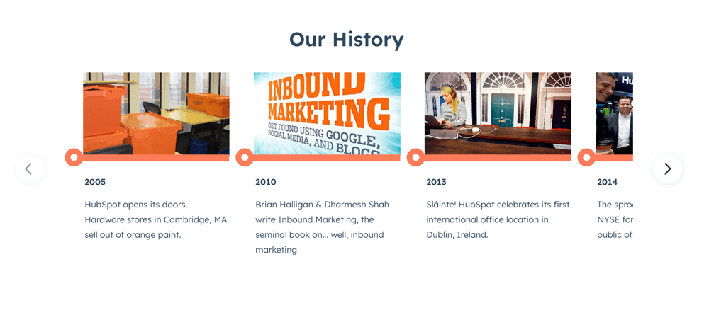
Timeline of key milestones
- A concise timeline of key milestones or achievements helps to tell the company’s story, establish credibility, and foster trust and confidence among potential clients, stakeholders, and future employees.
- It can be milestones that showcase progress, growth, expertise, awards, significant achievements, industry leadership, values, and culture.
Images
- The images should continue telling the company’s story and personalise the key message by utilising company or team-related images.
Mission / Vision / Values
- This section should convey the core values which drive your work and establish a sense of alignment between your brand and the target audience.
Corporate Social Investment (CSI) (Optional)
- Showcasing your CSI initiatives helps to position your brand as a positive force in society. It provides further opportunities to highlight how your values align with your company’s actions.
- It can also be especially important in attracting talent. Research shows that Millennials and Gen-Z put a high value on a company’s purpose and societal impact.
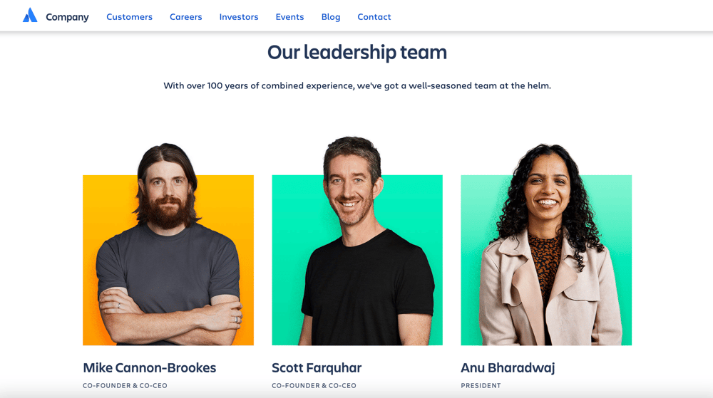
Meet the team/leadership
- Brand-centric images of the team or company’s leadership help to humanise your brand.
- Depending on the layout and design, this section can include a brief bio of each team member or it can link out to an individual team member page which provides more details on the person, as well as the relevant contact details.
Company culture
- Showcasing your company culture, values and work environment helps to attract clients, partners and employees who share similar values and beliefs.
Service page
*For the sake of brevity this section will focus on Services, however, the content is also applicable to Products or Solutions.
A service page is designed to inform a company’s target audience about each of their respective service offerings. It should explain what the service is about and how it benefits the target audience. The rest of the content on the page should be dedicated to reinforcing this key message through testimonials, records of work (such as company logos) and case studies.
Headline
- The headline should be the name or title of the respective service.
- It should answer what you do.
Sub-headline
- The sub-headline should be a short description which provides the value proposition of the service.
- It should answer how you’ll provide value with this respective service.
CTA
- In the case of a service page, the CTA can be an anchor link which navigates to the lead generation form on the page, or it can direct to the contact page where the user can enquire accordingly.
Hero image/video
- It should align with the brand story, create visual interest and support the headline and sub-headline.
Service overview
- This section should provide a brief introductory overview of the service.
- It should answer the what and why of the particular service.
Images
- Use images to break down your service related information into easily digestible chunks.
- Ensure that your images relevantly support the service-related information and continue to align with your overarching brand story.
Features
- A list of features provide the opportunity to highlight the service’s value in an easily digestible format.
- The user should be able to skim read the key points and understand the primary value of the service.
Benefits
- This section should highlight the benefits of the service and the value that it will provide to the target audience.
- Similar to the features section, the information should be presented in a neatly summarised fashion so that the key message is instantly understood by the target audience.
Frequently Asked Questions (FAQ) (Optional)
- A FAQ section should provide the target audience with clear answers to common queries they may have about the service.
- The questions listed should be an accurate representation of the target audience’s primary pain points, reservations, or concerns.
- The answers should be helpful, informative and value-oriented. It should always address the queries in a way that aligns with the brand tone and reinforces the brand value.
Social proof (Optional)
- Depending on the nature of the business and its services, a social proof section can be included.
- If a record of work, or service-related testimonials are available, it can go a long way in reinforcing the service’s key message and value proposition.
Lead generation form
- If, up until this point, the user journey has been crafted with a targeted brand story and the user has been provided with the information that they were looking for, then a lead generation form provides a great opportunity to capitalise on the strategic storytelling.
- By implementing a lead generation form on the service page, it gives you the opportunity to effectively funnel and qualify your prospects accordingly.
- The form should not contain too many qualifying fields, otherwise the user will be discouraged from completing this step in the conversion journey.
Resources
- In the event that the user does not want to complete the form just yet, the page can be concluded with a case studies (or blogs if case studies aren’t available) section.
- Case studies provide the opportunity for the user to continue their journey and to keep them on the website for longer.
- Specific service-related case studies also further establish trust and authority among a company’s target audience.
Blog page
Business blogging is a marketing tactic whereby a company writes helpful articles on, for example: industry developments, trends, tools, strategies, company news and services. It provides both existing and potential clients with an opportunity to engage with the company through the medium of helpful information.
A business blog is therefore an important website page that helps to support business growth by:
- driving traffic to the website
- converting traffic to leads
- driving long-term results
- increasing brand awareness
- establishing trust, industry authority and thought leadership
Headline
- The headline or blog title should clearly indicate that it is a blog page or resource center.
Sub-headline
- It should briefly indicate what the blog page is about and it should preferably be positioned as a helpful resource center.
- It should entice the target audience to spend time on the page and inspire confidence that they will find helpful information.
Hero image / video
- It should be a brand-centric visualisation of the blog and its key message.
Topics / Category headings
- Your key business-related topics should be highly visible, organised and offer easy navigation to the respective topics.
- All the blogs should therefore be tagged properly so that the users can easily find the desired information.
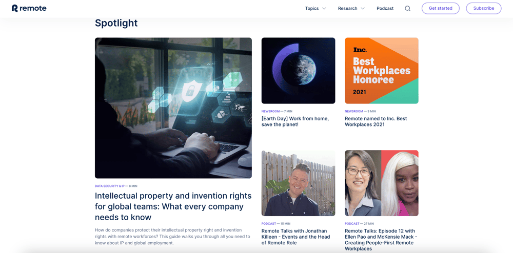
Featured article
- This section provides the opportunity to highlight one or more (dependent on the page layout and design) important articles.
- It can be a key piece of content that is highly informative and has proven to attract a lot of visitors.
Blog articles listing
- The rest of the blog articles can be listed in reverse chronological order to ensure that the target audience always finds the company’s latest news and insights.
Pagination
- The blog listing page should offer easy navigation to older posts. This provides the opportunity for the user to spend more time on the company’s website and engage with more helpful content.
Contact Page
A contact page serves as a crucial point of communication between visitors and the company. It should provide a clear and concise user journey to facilitate effective contact and engagement.
Headline
- It should be clear, action-oriented and confirm that it’s a contact page. The headline or page title should confirm that it’s a contact page.
Sub-headline
- It should reinforce the company’s willingness to get in touch and motivate the prospect to complete the contact form.
Hero image/video
- It should be a brand-centric visualisation which mirrors the key message and motivates the prospect to get in touch.
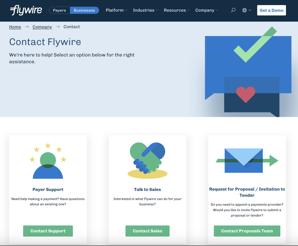
Contact form
- The heading should be welcoming, confirm the required action and set an expectation on how the company will respond.
- The form should contain all the essential fields of required information, but not overwhelm the prospect.
- It’s recommended to include at least one or two segmentation fields which would help qualify or funnel the prospects accordingly.
- Ensure that the legally required privacy disclaimer is visible and that the user clearly understands what they are providing consent for.
Location details and contact numbers
- Clearly display the relevant contact details which provides the user with an alternative method of contact.
- Consider including a map or clear directions if you have brick and mortar offices which are regularly visited by your target audience.
- Further potential inclusions:
- Business hours: Specify the relevant business hours and set clear expectations in terms of response times.
- Social media links: Depending on the nature of your business, you can include links to your relevant social media channels where the target audience can further engage with you.
Final Thoughts
The strategic design of a B2B website plays a pivotal role in the success of a business in the digital landscape. By prioritising a positive and intuitive user experience on its website, a business can boost conversions, enhance brand perception and improve search engine rankings. Ultimately, it will give a business an advantage and increase their chances of success in a highly competitive digital environment.