We promise you that if you do - your website will be engaged more by your users; and that engagement will lead to higher conversions if that is your goal. Sometimes the most simple and easy changes are the ones that yield the best results; and with some basic knowledge you can achieve these improvements without a professional web development company.
Our quick tips to easily improve your WordPress website:
1. Use Authentic Imagery
The Shutterstock creative trends of 2018 (view here) suggest using authentic, believable and realistic imagery. Using images that look and feel authentic to your brand or message can be the difference in drawing in (or turning away) users.

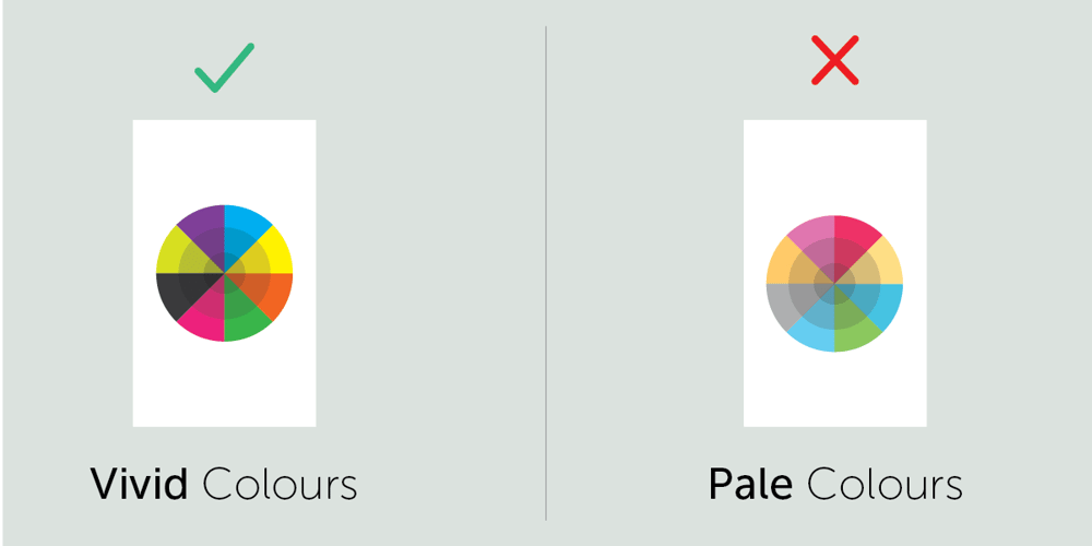
2. Use Vivid Colours
Now is definitely the time to use vibrant colours, vivid colours stand out from the background and injects a sense of energy into your web pages. Engagement requires energy from your users, so energise them. Remember the colour for the year is ultra violet - Shades of purple are in!
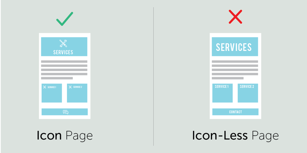
3. Use Icons
Adding simple icons in content boxes can drastically enhance a web page. Icons can guide user to the utility of a page without the need to actively read what the content are. The more visual cue's you can give your users, the more engaged they will be.
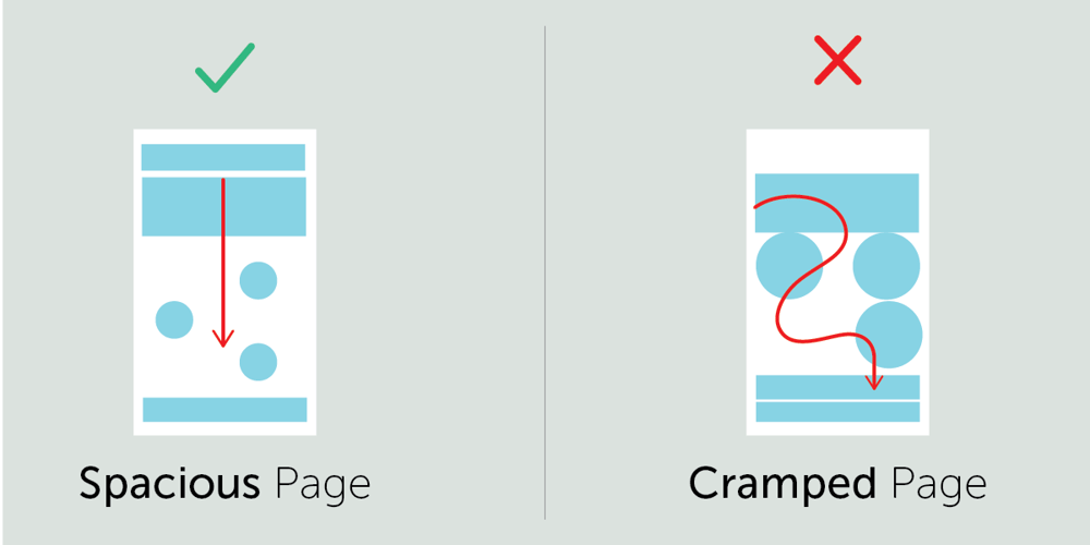
4. Create White Space
Creating space around page elements is often overlooked. Adding a bit of empty space around elements can go a long way in enhancing your Site. Rather have too much white space than too little. Cluttered pages tend to have higher bounce rates.
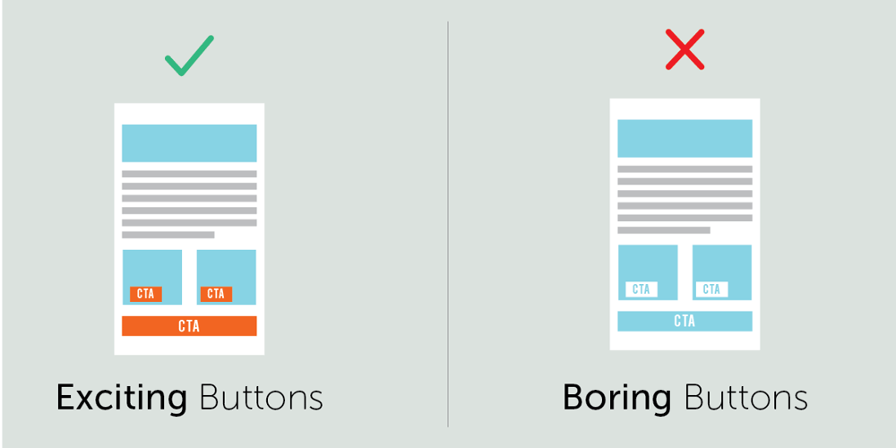
5. Use Simple Stand-Out CTAs
Call to Actions on pages such as Contact Us, Request Quote, Order Now should stand out on a page to attract attention. To make them stand out, your site must have predefined rules related to CTAs. CTAs should all conform to specific colour and size rules. If you are not sure how many rules you should have, stick to one colour and one size for all your CTAs. This will lead to a more consistent experience and higher engagement and conversions.