Content Marketing has become a staple in any and every company’s digital marketing strategy given its ability to generate leads and drive sales conversions.
Marketers have become more conscious about testing various elements like fonts and colours, to see how they affect customer turnover, and ultimately understand how strong an influence content has over a reader.
For obvious reasons, the actual topic and the interest it will ignite in the reader will always come first. However, more intuitive factors, things as seemingly insignificant as choosing the correct typeface, are what tip the scales in your favour.
You may think you’re in the clear by avoiding Comic Sans, but when you take close consideration in choosing the right font, you can infuse your content with style and personality, tapping into the emotions of your customers.
Why does Typography matter so much?
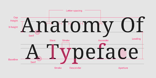
Typography is the perception generated by the way in which the text is arranged or stylised on a page. This arrangement involves the selection of typefaces, point size, line length, line-spacing (leading), letter-spacing (tracking) and adjusting the space between letter pairs (kerning).
Most designers refer to typography as a form of art, as it can be tremendously creative and innovative in the marketing industry. Type, just like imagery, can evoke certain emotions when and if done right. Using typography strategically grabs the reader’s attention, controls where the eyes move and evoke emotion. Type choice affects the experience of the reader, especially their first impression of who you are and what you do, though sometimes they do not value those emotions.
Many businesses focus on generic stock imagery to represent who they are, and choosing a typeface, unfortunately, takes a back seat in the process. However, to set yourself apart, it is important to take some time to think about your typography choices and the feelings they convey. This all helps the reader to understand the content better (and enjoy it more).
And that is why typography is regarded as a significantly great tool for enhancing emphasis on a certain message - to create interest and to add personality to the actual content.
These observations have further proved that humans visually perceive words and typography style as a whole, rather than individually. This is known as ‘Gestalt Psychology’.‘Gestalt’ is a German word meaning shape and form, and ‘Psychology’ refers to our ability to acquire and maintain meaningful perceptions.
The principles of effective Typography
Readability
Typography has visual appeal. It should compliment your text and not overpower it. Readability depends on factors like tracking, kerning and leading.
The right line-height and letter spacing are as equally important as selecting the most suitable typeface for a brand’s style. This helps with the readability and legibility of the content by maximising the spacing of the letters, words and paragraphs making the content easy and enjoyable to read.
Less is more
Keep the number of fonts on a page to a minimum. Using only two or three different fonts seems to be working more effectively than using seven or eight different fonts and only makes content confusing.
White space is not ‘empty’, it gives type space to breathe. Resist the temptation to fill every inch of a page with text. Don’t be afraid to leave adequate spacing between sentences. This negative or white space helps focus attention on the text.
Keep it consistent
Consistency applies to good branding. It is best practice to choose typography that creates brand consistency everywhere that people encounter your brand. Everything should create a sense of overall flow and should be recognisable to the brand itself.
When there are so many Typography Styles out there, how do you know which one to choose?
There are some crucial principles to consider when choosing which typography style to use to enhance content display:
Invariance
This is the essential principle of Gestalt. People prefer to see typography that is simple, clear and ordered.
Closure
While invariance seeks simplicity, closure is the opposite of this principle. Closure involves combining multiple parts to form a simpler whole. Our eyes fill in the missing information to form a complete structure.
Continuation
The human eye follows the paths, lines, and curves of a design layout, and prefers to see a continuous flow of typography rather than separated typography.
Reification
This suggests that we don’t have to present the complete typography in order for viewers to see it. We can leave out parts of the typography as long as we provide enough of it to allow for a close enough pattern match.
Common Fate
This is typography that moves in the same direction eg. Italics
Focal Points
This is typography with a point of interest, emphasis or difference that will capture and hold the viewer’s attention. The best typography choices for content depend on the intended feelings, emotions and associations to be conveyed. Just as you would spend time choosing the colours, pictures or layout, the same attention should be given to your choice of typography.
Common display Typefaces
Let’s look at some examples of common display typefaces, Serif, Sans Serif, Script and Modern family, and how they perform to bring across a particular idea, feeling or emotion.
The Serif Family
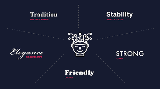
The Serif Family is a traditional, respectable and reliable typeface. Favourable examples of serif fonts include Baskerville and Times New Roman. It uses small lines at the end of characters to add fluidity and motion to the words.
The Sans Serif Family
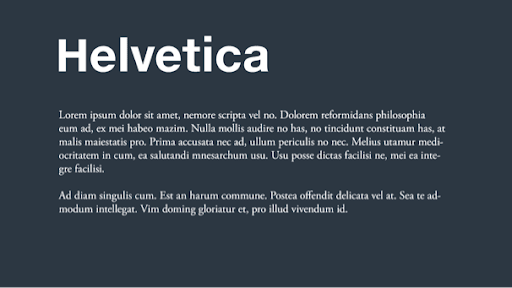
The Sans Serif is a category of typefaces that do not use serifs (the small lines at the ends of characters typeface). The Sans Serif fonts are known to be stable, clean and modern. Examples of sans serif fonts include Helvetica Bold, Calibri, and Myriad Italic.
The Script Family
The script fonts are identified by their fluid and varying lines, similar to handwriting. They represent elegance, creativity and affection. Some of these examples are Brickham Script, Lavanderia and Edward Script.
The Modern Family
The Modern Family is recognised for their heavy downstrokes and regular shapes. These represent strength, swag, modernity and are very progressive. Popular examples include Futura, Didot Italic, and Century Gothic.
The Display Family
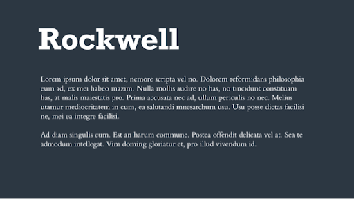
The Display Family fonts are usually larger than text fonts and give a distinctive character to mainly corporate or business content. They come across as friendly, unique and expressive. Examples include Valencia, Cooper, and Spaceage Round.
What about pairing?
Before deciding indefinitely on a typeface, remember that your choice may not always stand alone. One thing that is very helpful when pairing typefaces, is consciously thinking about the structure of typography in front of you.
When we talk about using more than one typeface, the concern is that things can get messy fast. However, if used thoughtfully and with purpose, two or even three typefaces can create seamless content and design. Pairing fonts can help distinguish between elements like headings, subheading and body copy.
Playing around with the font size and weight can also help with the contrast between the elements, and is a simple way to communicate importance on your page.
Final thoughts
The right typeface and spacing go a long way in making your content inviting and enjoyable. Many elements can affect how people feel towards your content and, as a result, one has to always keep in mind the impact that content has on the reader.
With the help of these tips, you can portray a professional appearance that will help control your messaging, user experience and branding. For more insight into content marketing and how you can improve upon your efforts, have a look at our free content marketing guide below and get started today.