In addition to fulfilling an important functional role in digital branding, typography is used to convey a brand’s personality and effectively evoke emotional responses from the target audience. Through its inherent ability to express tone, character, and style, typography can influence how viewers perceive and interact with text, and by extension, the message or brand it represents.
This article will therefore explore the different typographical components that can psychologically influence a brand’s target audience.
Key Takeaways
- Different font types, such as Serif, Sans-serif, and Script, each have distinct associations that impact how a brand is perceived.
- Font weight and style impact how text is perceived. Lighter fonts are viewed as delicate, while bold fonts denote strength.
- The spacing between letters and lines influences readability and the message's tone. Tight spacing can suggest efficiency, but can be intimidating, whilst more generous spacing makes content more approachable.
- Fonts can evoke specific historical, cultural, or geographical connections, impacting how a message is received across different audiences.
- The combination of typography and color palette should reflect and enhance a brand’s personality and desired emotional appeal.
How does typography influence perceptions?
A brand can send out a well-intentioned message about an important topic that can be completely misconstrued by the target audience due to the usage of an inappropriate font. Take a look at the following example which humorously showcases how the same sentence can have two completely different meanings by just changing the font.
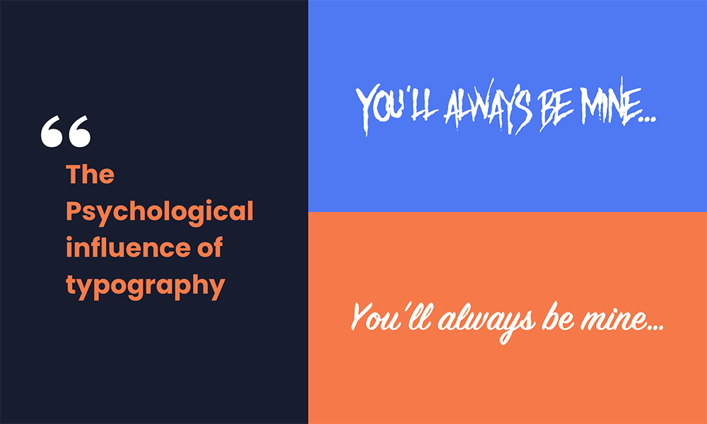
The two different fonts in this example illustrate that it’s not only important what you say, but how you say it as well. The different fonts set different tones and evoke different feelings.
By understanding the psychological associations of different font types, brands can better align their typography with their brand identity, set the appropriate tone for a marketing campaign, and elicit the desired emotional response from their visual communications.
But how exactly does typography influence the target audience’s perceptions? The following breakdown explores the 5 facets of typography that are predominantly responsible for this psychological influence.
1. Font Associations
Different fonts exude distinct characteristics. For example, Serif fonts often convey a sense of tradition, respectability, and reliability which makes them well-suited for established, historic, and traditional brands.
In contrast, Sans-serif fonts convey a modern, minimalist, and clean image which aligns well with contemporary or tech-oriented brands. Additionally, Script fonts are associated with elegance and creativity which are fitting for brands in the beauty or luxury sectors.
Thus, as each font type carries a distinctive set of characteristics it is important to select a font that aligns with the brand’s identity, values, target audience, and overall messaging strategy.
2. Font Weight and Style
Font weight refers to the thickness of the font characters and can range from very thin, regular, bold, to extra bold. Lighter fonts are perceived to be more delicate and sophisticated, whereas bold fonts command attention and are associated with strength and urgency.
Font style refers to the slant or emphasis of the font characters such as oblique, italic, to upper and lowercase lettering. Italics can be used to convey motion, emphasis, quotes, or to add a personalised touch to a message.
Both font weight and style can be used strategically to create visual interest, establish an information hierarchy, and add emphasis. For example, a regular font weight can be used for body text, bold text for headings to make them stand out, and italics to highlight important information. Choosing the right combination of weight and style can enhance the effectiveness of a brand’s message.
3. Letter and Line Spacing
Letter spacing, also known as tracking, refers to the amount of space between the letters. Tight letter spacing provides a sense of urgency, tension, or efficiency, and can be utilised to convey a modern, streamlined appearance. In contrast, more spacious letter spacing can make the text feel less constricted and can convey a sense of tranquility or luxury.
Line spacing, also referred to as leading, refers to the amount of space between two lines of text. Tight line spacing should be used carefully as it can appear intimidating and overwhelming to the user, whereas increased line spacing can make content more approachable and easier to digest.
4. Contextual and Cultural Associations
Certain fonts contain deep historical or cultural associations that can evoke specific emotions or connect with particular audience segments. For example, fonts such as Blackletter, Roman, and Renaissance fonts reflect the artistic and cultural tendencies of their particular period in history. In modern times the usage of these Serif fonts conveys a sense of tradition, heritage, and trustworthiness to brands who wish to portray these characteristics.
Similarly, fonts can also reflect geographical and cultural influences, such as fonts that contain curved scripts reminiscent of Arabic calligraphy or brush strokes that mimic Asian calligraphy. These fonts can be utilised to pay respect to specific cultures and to resonate with the target audiences within these geographical regions.
Typography can also be stylised to create the appropriate tone or to fit in with a specific context. This stylisation can convey characteristics such as playfulness, elegance, creativity, and authenticity to name but a few.
Ultimately, brands that operate in global markets or across multiple cultures, need to ensure that their typography aligns with the cultural preferences or contextual norms of the target audience.
5. Colour Integration
The psychology of colour is another important factor to consider when constructing a brand’s identity, as the colours also contain an inherent set of psychological associations. It is therefore important for a brand’s typography to integrate with the intended characteristics of its colour palette to ensure that it reinforces the brand’s personality, values, and emotional cues.
For example, a brand that wants to appear approachable and fun can use bright, vibrant colours along with a playful font to foster a connection with a younger target audience. Similarly, a traditional finance company can integrate Serif fonts with its primary blue colour palette to demonstrate its trustworthiness and dependability.
Final Thought
The psychological influence of typography is multifaceted as it affects brand perception, emotional responsiveness, communication tone, contextual relevance, and cultural resonance. By strategically weaving together the influential elements, brands can ensure that their identities and key messages are communicated effectively and foster an emotional connection with their target audience.